Don't clone that GUI (how about this instead?)
It has been a fairly common occurrence that when somebody switches into open source software, he will eventually try to introduce the GUI of a commercial software he used previously. This is awful practice for so many reasons:
- The notion of what is familiar to many people is a poor measure of quality.
- The choice of a GUI may capture deeply extending design choices. It is implied these are inferior choices even if they might not be.
- It incorrectly implies closed source software vendors are better equipped, more motivated, more resourceful, more invested or more capable of implementing an useful GUI.
- Often a reason why particular GUI works for a software is related to the details it does right for that particular program, rather than to the shapes and appearances that are familiar to people who are using it.
- Existing users of the software are familiar with the GUI that's present. Unless they all agree that it's bad, then there's an issue of alienating those users.
- If the GUI is being successfully cloned then it's possible that people using free versions of that software feel invited to try it out, but those are usually consumer-minded at the moment and unwilling to learn new things or contribute. In the best case there's no harm, but in the worst case it's a series of draining experiences to the contributing community.
But if it's a bad idea, and you still need a better GUI, how to improve GUI in an existing open source software?
Contribute to the documentation
Unfamiliarity can be a bane of an otherwise excellent GUI. If the GUI is good once you understand it, then documentation helps.
You can either directly modify the existing documentation and contribute it back or write tutorials and either one does well. If you want the community to be able to work onward from it then use a creative commons license.
Troubleshoot people and see how they fail to use it
Sometimes a simple thing may break an use experience. For example your configuration dialog might be missing a prompt that asks whether to set the configuration when the modified dialog is closed without an OK.
You may figure out these kind of problems when you instruct people how to do specific tasks with the software, that they want from it, and tell you'd like if they would report back on how did it go with some snip-screenshots about their hardships with the program. Next be generous and assume these people tried to do it right once they report.
Once you find out how they failed in the interaction, you then know what to fix.
Explain the information
Lets say you get a big cockpit of various lights and dials. There's a general good practice for how to make a person not mind the dial.
For each dial and switch, do this:
- Explain what that dial is presenting.
- Tell why you need that dial.
- Have the dial represent the information in a format that is good for the intended use.
Next organize these dials and group them in a way that they make sense for the given context where they appear.
If there are a lot of dials, allow the user to ignore most of them and focus on some limited group, then allow more of them to be introduced when user needs them.
Affordances
One really easy way to improve software is to present affordances. Provide cues that illustrate that certain actions are available.
Even if affordances were really unique to the program they can work if they are forming a clear language and remain documented properly in a well-written user guide.
2020-09-24: There is an article from UX collective, emphasizing that the word "affordance" refers to the association that forms between cues and actions. They insist that the cue of an affordance should be called a signifier. I received this because I originally wrote that affordances are cues, "these are cues..". I replaced it with "Provide cues..".
That you are precise with terminology is a good thing. For instance, here's a description of an affordance: A button inscribing some response on it signifies that you can produce such a response by clicking the button. Not confusing the word to mean the button itself helps to ensure the affordances end up into the software.
It is worthwhile to emphasize that an affordance behaves like a contract between the user and the interface. An affordance ceases being an affordance if the cue appears alone, lacking the action.
Modal interfaces
If you want a really good user interface then give it modes like how Vim has them.
That means, organize the user interface around tasks that are done with the software, such that tools that are used at the same time are on the same tab.
Now this can be done badly and there are examples of this. If the information presented by different modes is needed simultaneously, yet you make the navigation between modes slow, and hide the keyboard cues to switch between them, then you just end up annoying the user.
There's an old practice that was present in Macromedia HomeSite and Lotus eSuite (pictures from Wikipedia). They organized their toolbars into tabs like these.
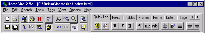
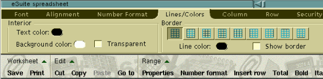
Although these interfaces didn't treat them as modes, it's an outdated enough concept that you can use tabbed toolbars to signify modes. Change the behavior of the program depending on which tab in the toolbar is opened.
Mode errors in modal interfaces
2020-09-24: This and the next section was added because there's a disrepancy I was informed of. Universities teach UI designers to produce modeless interfaces because modes are perceived to be bad UI design.
Mode errors are a very common source of frustration. I recommend reading through the Wikipedia article you find through the link in this paragraph. In my opinion vilifying modes does not help on this though. These mode errors are caused by things you do not necessarily recognize as modes! Lets go through some examples:
- Notification pops up when you’re trying to do something and you click the notification away accidentally. The action messes up whatever you were doing, and you didn't get the opportunity to read the notification.
- Something steals the keyboard focus while you're writing a command. The command is interpreted in some entirely different context than that you were intending to use.
- A prompt grays off everything else in front of you. It requires you to commit an action, but to answer properly you'd have to look up something. However the system prevents you from doing things until you've answered to the prompt.
How many people think that positions and configurations of windows on the screen are state? Windows popping open and moving around on your screen are super popular things to do.
There are things why Vim users are fond of their modeful UI.
- Vim never abruptly shifts from
--INSERT--to--VISUAL--. - Pressing the ESC -key resets all the mode settings, bringing the program to an initial state.
- Switching from a mode to an another is instant.
- The results that were produced during the mode set are all recorded and mode switch does not destroy them. You have to actuate a command to discard it.
- A very small or little volatile state is associated to each mode, meaning that hardly any input end up being discarded during a switch between modes.
- It is very clearly marked which state is active at the any given moment.
Perhaps there are certain good rules for modeful UI that should be established:
- The mode changes immediately upon an user request of mode change.
- The mode is hidden from the external actuators, that is, Eg. software is banned from resizing windows or stealing focus, unless there is a request from the user to automatically layout the window.
- The mode never changes due to an external action.
- The mode is always presented on the screen when it's active.
- The volatile internal state that is destroyed on the mode exit is visible on the screen as well, and it disappears accordingly when mode is exited.
- There is never more than a little bit of user input associated to the mode.
These rules hopefully resolve disrepancies that are present when discussing modes.
Proper ways to inform users.
"How can I otherwise notify an user?" Somebody asks.. How about a small "🛈⚠" -symbols in a corner that either start flashing if there are messages in a log? By hovering over it'd stop flashing but remain visible. Clicking on it would always open the message log. When there are no messages, it'd stay grayed out but always in the location where it was.
- This interface would be like CTRL+C/CTRL+V in the system.
- It would be never interfered by an another program, and you could group, filter and ignore messages from software that use the notification for advertising or nagging.
- It'd be configured with different symbols by the user, and it'd be never reconfigured by software.
How cool would that be?
Recognize physical limits of users
In a bit similar theme, it's a good point to note that certain key combinations, especially an excessive use of mode keys, is just yuck. Horrible!
One mode key down can be nice, but two is starting to be excessive and three or four are definitely don't do that.
Another thing to look for is physical fidelity a person has with a mouse or fingers. Harder it's to land to a small area farther the mouse moves at once.
Error correction
Some of the best user interfaces have some error correction capabilities that trigger up and propose fixes if you happen mess up. This includes concepts & algorithms such as fuzzy search and language edit distance.
Robustness
Some really easy way to make a really friendly user interface is to make it robust in the following sense of the word.
If there's a long running action, or an action that takes effort to actuate. Make it probe whether the action can succeed in the first place before letting user to run it properly.
Also in very complex inputs it may be preferable to save or provide presets for those inputs.
Conclusion & reserving some right for refinement of these ideas
UI design is quite big topic on itself, but I'd prefer that people would come up with their own solutions rather than just ping-pong copy mediocre designs from each other until they deteriorate to lumps of buttons and boxes. I hope this article helps you to come up with better GUI designs.
Now I'm not sure whether I got all of this right. I'd believe this turns out to be good advice, but it may need additions and refinements.
If you come up with something that you find to be a good general advice for constructing a GUI, I'd like to hear about that so that it can be added up here.
Also if you applied the advice on this site, or have applied similar guidelines, hey I might eventually like to write an article about it and feature you in this blog.
2020-09-24 update: Recent lobter.rs discussion had plenty of good points and advice. I improved this text in response, the updates are clearly marked.